
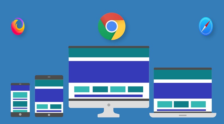
Overcoming browser compatibility challenges is essential for good web experiences. Ensuring consistency across platforms can be difficult with diverse browsers like Chrome, Firefox, Safari, and Edge. Addressing these issues requires an effective strategy.
Developers can mitigate compatibility issues to enhance website functionality and performance across multiple browsers by prioritizing accessibility and user experience. Let’s see some practical strategies to improve development and optimize browser compatibility.
This blog explores practical strategic approaches to overcome browser compatibility hurdles, from understanding common issues to implementing solutions like feature detection, polyfills, and testing methodologies.
Table of Contents
Understanding Browser Compatibility
Browser compatibility ensures that a website works similarly on different browsers. Each browser has its way of understanding and showing websites. They render differently because they use different engines to understand code. It can make a website look or act differently depending on your browser.
Browser versions and updates can impact compatibility as new features or changes in rendering engines may affect how websites are displayed or function. Developers consider differences and ensure websites work smoothly on all browsers and platforms.
Strategies for Overcoming Browser Compatibility Challenges
Here are some of the methods to overcome browser compatibility challenges:
Feature Detection
Feature detection is a technique used in web development to determine whether a specific browser supports a particular feature or functionality before utilizing it in code execution. Feature detection focuses on detecting the presence of particular capabilities.
This approach involves checking for the existence of a feature or API using conditional statements in JavaScript. If the feature is supported, the code proceeds to use it; alternative methods can be implemented to ensure graceful degradation or enhancement of functionality.
Feature detection focuses on capabilities rather than specific browsers. This makes code more adaptable to changes in browser landscapes. It enhances browser compatibility by allowing developers to create code behavior based on each browser’s capabilities to ensure a consistent user experience across different platforms.
Polyfills
Polyfills are JavaScript code snippets or libraries that replicate modern web APIs in older browsers lacking native support for these features. They bridge the gap between older and newer browser versions to utilize the latest web technologies and ensure compatibility across multiple browsers.
Suppose a developer wants to use a feature like the Fetch API supported in modern browsers. They can include a Fetch polyfill in their code. This polyfill will provide the necessary functionality for making HTTP requests in browsers that don’t natively support the Fetch API.
Some popular polyfills include:
- ES6-Promise: Allows to work with environments that do not natively support promises by default and enables one to write asynchronous code.
- io: An automated service that provides a polyfill corresponding to the rooted-out feature in a user’s browser to reduce the number of polyfills loaded.
- Babel Polyfill: Makes use of the new features of JavaScript, like arrow functions and template literals in older browsers, by converting them into a code compatible with the old browsers.
- Fetch Polyfill: Implements the Fetch API in browsers that lack native support and allows developers to use modern approaches for making HTTP requests across all browsers.
These examples show how polyfills help developers use modern web features to maintain compatibility with older browsers.
Progressive Enhancement
The progressive enhancement strategy is about first providing a functional user experience for all users before enhancing the user’s experience for those with more advanced technology.
They transform the web into a place everyone can access and develop their application without restriction. Progressive enhancement at the initial stage implies building a structure using flooring technologies such as HTML, CSS, and JavaScript. This can guarantee the website can work successfully and be used even with older browsers with limited functionalities.
Progressive enhancement considers that a user’s device or browser is always improving, so new functionalities or features are added, such as richer user interfaces, animation, and interactive elements that adopt modern web technologies.
Progressive enhancement improves compatibility and user experience in several ways:
- Compatibility: Progressive enhancement provides a service that can be accessed and used by different devices and browsers, including older or less capable variants.
- Accessibility: Prioritizing the delivery of the core content and functionality will ensure the website is usable and accessible for individuals with disabilities or those using assistive technologies.
- Performance: Progressive enhancement cuts the device’s unnecessary data loading and decreases so that code and resources come first. This auto-adjustment allows information to load faster and adequately responds to devices with slow internet connections or connection problems.
- User Experience: The process of progressive enhancement offers any user a responsive experience; it depends on the browser capabilities where it can be further enhanced.
Vendor Prefixes
Vendor prefixes are added to CSS properties by browser vendors to implement experimental or proprietary CSS features before they are standardized. They allow developers to use new CSS features before they are widely supported across all browsers to push the boundaries of web design and development. Vendor prefixes enable browser vendors to implement and test new CSS features without causing conflicts with existing or future standardized properties.
For example,
- -webkit- is used by WebKit-based browsers like Safari and Chrome
- -moz- is used by Firefox
- -ms- is used by Internet Explorer.
Effectively utilizing vendor prefixes in CSS involves adhering to several critical best practices. It’s essential to use vendor prefixes to reserve them for testing new features rather than relying on them for production code. When employing prefixes, ensure they are necessary and provide fallbacks for browsers that do not support the prefixed properties, thus maintaining compatibility across different platforms.
Updating prefixes is crucial as CSS specifications evolve and browser support for certain features may change. Regularly reviewing and updating CSS code helps to remove outdated prefixes and ensures compatibility with the latest browser versions.
Auto-prefixing tools such as Autoprefixer can streamline the process by automatically adding the necessary prefixes based on the browsers targeted for support. It saves time and reduces the risk of errors to ensure consistent and reliable rendering across various browser environments.
Thorough testing is indispensable when using vendor prefixes, given their association with experimental or early-stage features. Testing CSS code across different browsers and devices helps to identify and resolve browser compatibility issues to ensure consistent behavior and appearance for all users.
Modern CSS Techniques
Modern CSS techniques like Flexbox and Grid have revolutionized how designers arrange their layouts on the web and offer multiple tools for responsiveness and flexibility. The Flexbox model is a layout model that enables dynamic alignment and distribution of elements inside a container to create exciting layouts. It provides a more efficient and intuitive way to design interfaces for components with variable content or unknown dimensions.
CSS Grid introduces a layout system that operates in two dimensions to give developers precise control over rows and columns. Developers can create complex grid-based layouts that adapt to different screen sizes and devices with Grid.
These modern CSS techniques aid in achieving consistent layouts across browsers by providing standardized, well-supported methods for layout design. Flexbox and Grid offer native solutions widely supported across modern browsers to reduce the need for browser-specific fixes or workarounds. This results in more predictable and reliable layouts to enhance the user experience across various platforms and devices.
Cross-browser Testing
Cross-browser testing ensures the same quality user experience across browsers, devices, and platforms. Browsing the internet from different devices and browsers is expected, meaning the website should function perfectly in all scenarios involving various rendering engines.
Testing across multiple browsers helps identify and resolve compatibility issues early in development to prevent potential user frustration and ensure broader accessibility. It also enhances the credibility and professionalism of websites.
Developers can utilize manual and automated testing tools to conduct cross-browser testing efficiently. Manual testing involves accessing the website on different browsers and devices to evaluate its performance and appearance. Automated testing tools such as Selenium automate the process by simulating interactions and rendering across various browser environments.
Using Real Device Cloud
Another strategy to overcome the browser compatibility challenge is to use a real device cloud. To ensure that websites or web applications function seamlessly across all browsers, it is essential to test on real devices. However, it is costly to have an in-house lab of physical devices. An actual device cloud allows you to test your applications across diverse browsers and devices.
Integrating cloud platforms into your development workflow can further enhance browser compatibility efforts. Developers can ensure consistent performance across various environments and improve collaboration among team members by using cloud resources for cloud testing and deployment.
You can use LambdaTest, a platform powered by AI that allows for testing orchestration and execution, allowing users to conduct manual and automated tests on a large scale across more than 3000 real devices, browsers, and operating system combinations. LambdaTest offers extensive support for various automation testing frameworks and tools for testing web and mobile applications. It seamlessly integrates with Selenium, Cypress, Playwright, Puppeteer, Taiko, Appium, Espresso, XCUITest, and other tools.
Responsive Design
It ensures websites can adapt to varying viewport sizes through fluid grids, flexible images, and media queries. This ensures optimal viewing experiences across various environments to enhance user engagement.
It resolves compatibility issues by accommodating different devices and future-proof websites. Developers can deliver user-friendly experiences websites across diverse browsing environments by prioritizing responsiveness in their development workflow.
CSS Resets and Normalize.css
Maintaining consistent styles across different browsers can be quite challenging due to default styling and rendering behavior variations. This is where CSS resets and Normalize.css become significant.
CSS resets are sets of CSS rules designed to reset or normalize the default styles applied by browsers to ensure a consistent starting point for styling. CSS resets lay down a clean slate and allow developers to use their styles consistently across different environments by neutralizing browser-specific styles.
Normalize.css offers a modern take on traditional CSS resets. It focuses on preserving useful browser defaults rather than erasing them. Normalize.css aims to make browsers render all elements consistently and in line with modern standards. It ensures a more predictable rendering of HTML elements across different browsers by applying a set of normalized styles.
Conclusion
In conclusion, overcoming browser compatibility challenges requires a strategic approach like understanding common discrepancies and implementing practical solutions like feature detection, polyfills, and modern CSS techniques. Developers can enhance website functionality and performance across multiple browsers by prioritizing accessibility and user experience.
Thorough cross-browser testing is essential to identify and resolve compatibility issues early on. Utilizing tools like CSS resets and Normalize.css establishes a consistent baseline for styling across different environments. Implementing these strategies helps the developers optimize browser compatibility and deliver smooth web experiences for all users.