
In the realm of data visualization and analysis, various charting tools and diagrams are widely used. One such visualization is the Funnel Chart. But what is a funnel chart? This guide aims to demystify this particular chart and explore its practical applications across various industries. Keep reading to unravel the mystery behind what exactly is a Funnel Chart.
Table of Contents
Understanding the Core Concept of a Funnel Chart

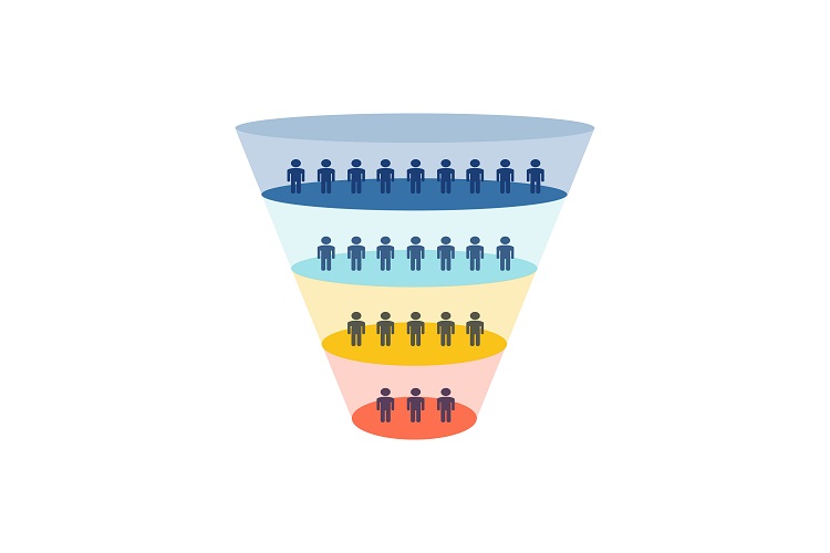
Alt Text: A type of funnel chart.
A Funnel Chart is an important tool for visualizing statistical data. This type of chart plays a vital role in mapping and analyzing different phases of a process or system. The shape of a funnel is symbolic of the gradual decrease that often occurs at each stage of the process.
Each segment or layer of the Funnel Chart symbolizes a particular stage of the process, with the width of each stage representing the quantity or the magnitude. This makes it easier for data analysts and businesses to comprehend intricate processes and identify trends or patterns.
The usage of Funnel Charts extends across a multitude of fields such as marketing, sales, and more. They are specifically useful in situations where stages lead to an outcome, and visibility of progression throughout these stages is required.
Essential Components of a Funnel Chart and Their Importance
One of the key elements of a Funnel Chart is the stages. Every Funnel Chart is divided into multiple stages, each representing a specific step in the process. This segmentation allows easy analysis of every step and helps highlight changes or trends within each stage.
The width or broadness of each stage is another crucial aspect. Typically, the width signifies the quantity or the size of data in each stage. This proportional depiction allows easy comparison and analysis of the stages.
Often, a value attached corresponds to each stage. This value, usually a percentage, indicates the conversion rate between stages. Such data points become essential for further analysis, decision-making, or strategic planning.
Practical Uses of Funnel Charts in Different Industries
Alt Text: A stack of coins.
Funnel Charts find wide-ranging applications across various industries. For instance, marketing teams often use Funnel Charts to visualize customer journeys or sales cycles, from initial contact to sales conversions. This helps in identifying potential ‘leaks’ in the funnel where prospects are dropping.
These charts make an essential tool for Human Resource departments too. They can be used to portray the recruitment process, from the number of applicants to the final hires, thereby helping in identifying stages with higher candidate drop-off rates.
The healthcare sector can use Funnel Charts to demonstrate patients’ progress through various treatment stages. They can also be used to trace disease spread, which is particularly relevant in the case of epidemics or pandemics.
Thus, understanding the practical use cases of Funnel Charts across different sectors can amplify their effective utilization.
Common Mistakes To Avoid While Creating a Funnel Chart
It is easy to misstep while creating a Funnel Chart if one is not careful. Some common mistakes to avoid include visualizing non-sequential data or using incorrect proportions for the stages in the chart.
Another error to steer clear of is misrepresenting or skewing the data. Incorrect data can lead to misleading visuals, which can hamper decision-making processes. As a result, it is important to ensure the complete accuracy of data before proceeding with the chart creation.
Altogether, understanding and using Funnel Charts can transform data interpretation and strategic planning. By understanding a Funnel Chart, and its essential components, one can leverage this effective tool to chart a course toward informed decision-making.