
Designing a digital product is about creating an experience that feels natural, easy to use, and enjoyable. A well-designed product helps users navigate effortlessly, complete tasks with ease, and leave feeling satisfied.
When done right, good design doesn’t just improve usability; it boosts customer satisfaction and can significantly contribute to a business’s success.
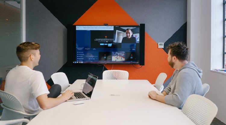
But how do you know if your design truly works for your users? This is where a remote user testing platform becomes essential. By gathering real feedback from actual users, these platforms help you uncover pain points, track user behaviour, and fine-tune your product before it reaches the market.
In this blog, we’ll look into the essential dos and don’ts of product design. You’ll learn how to create user-friendly, functional digital products and discover common pitfalls to avoid.
Table of Contents
Dos of product design
When designing a digital product, there are some golden rules you should always keep in mind. These dos can help ensure your product is visually appealing, functional, user-friendly, and accessible.
Let’s explore some essential best practices to follow.
1. Do prioritise user research
Great product design always starts with understanding your users. After all, how can you create something that meets their needs if you don’t know what those needs are?
This is where thorough user research becomes the foundation of a successful design.
A remote user testing platform makes this process easier and more effective by allowing you to gather both qualitative and quantitative insights directly from real users. These insights help you understand user behaviours, preferences, and challenges, enabling you to make informed design decisions.
There are several research methods you can use to gain valuable feedback:
- Surveys: A great way to gather insights about customer expectations, needs, and preferences.
- First-click tests: These help assess how intuitive your design is by analysing where users click first when trying to complete a task.
- Prototype testing: Ideal for early-stage designs, allowing you to validate concepts and identify potential issues before launch.
Prioritising user research helps ensure your product is designed with the user’s real needs in mind, leading to better usability and satisfaction.
2. Do create an intuitive navigation
No matter how visually stunning your design is, if users can’t find what they need easily, they’ll likely leave feeling frustrated. This is where information architecture (IA) plays a crucial role. IA involves organising and structuring content in a way that feels logical and easy for users to navigate.
To improve the overall user experience (UX), it’s important to focus on clear navigation elements:
- Menus should be easy to understand.
- Call-to-actions (CTAs) should be clear, guiding users to take the next step.
- Button placements should be consistent and easy to locate, helping users move smoothly through your site or app.
An intuitive navigation system helps users complete tasks quickly and with minimal effort, leaving them with a positive impression of your product.
3. Do test and iterate frequently
Product design is an ongoing journey of testing, refining, and improving. Regular testing allows you to pinpoint what’s working and what needs to be adjusted before it becomes a bigger problem.
A remote user testing platform makes it easy to conduct both moderated and unmoderated testing:
- Moderated testing involves a facilitator guiding users through tasks and gathering feedback in real-time.
- Unmoderated testing allows users to complete the tasks on their own, and helps provide more natural and unbiased insights.
Frequent testing ensures your product evolves with user feedback, helping you make meaningful improvements that enhance the overall experience.
4. Do maintain consistency in UI and branding
Consistency plays a major role when it comes to building recognition and trust. A product with a consistent user interface (UI) and branding looks professional and makes navigation more intuitive for users. Elements such as typography, colour schemes, button styles, and layout patterns should remain uniform across all pages and features.
When your design system is consistent, users can quickly learn how to navigate your platform, leading to a smoother and more enjoyable experience. Brands like Apple and Google are great examples of companies that maintain strong design consistency, contributing to their seamless UX and strong brand identity.
5. Do consider accessibility and inclusivity
Designing with accessibility in mind ensures that it can be used by everyone, including people with disabilities. However, accessible design doesn’t just help those with specific needs; it improves usability for all users.
Some best practices for accessibility include:
- Use high colour contrast to ensure the text is easy to read.
- Ensuring readability with clear fonts and adequate spacing.
- Supporting keyboard navigation for users who can’t use a mouse.
A remote user testing platform can help you identify accessibility barriers by gathering feedback from diverse users. This helps you refine your design to be more inclusive, creating a better experience for everyone who interacts with your product.
Don’ts of product design
While there are plenty of best practices to follow when designing a digital product, there are also common mistakes that can easily derail your efforts.
Avoiding these pitfalls can help ensure your design is both user-friendly and effective. Let’s take a closer look at what not to do when it comes to product design.
1. Don’t ignore real-user feedback
One of the biggest mistakes you can make in product design is relying on assumptions instead of real data. It might be tempting to make decisions based on what you think users want, but without actual feedback, you’re just guessing. Ignoring usability feedback often leads to poor design choices that frustrate users and drive up bounce rates—when users leave your site quickly without engaging.
Using a remote user testing platform helps you gather feedback directly from your target audience. By observing how real users engage with your product, you can uncover issues that might not be obvious at first glance.
This ensures your design choices are backed by real insights, not just assumptions, leading to a better user experience and increased satisfaction.
2. Don’t overload users with too many options
Have you ever visited a website that left you feeling overwhelmed by too many choices? Hick’s Law states that the more choices a person has, the longer it takes to make a decision. When users are faced with too many options, they can feel confused and may even leave without taking any action.
That’s why it’s important to keep your design simple and intuitive. Embrace minimalism by limiting options to what’s truly necessary.
A clean and streamlined interface helps users make decisions quickly and easily, improving their overall experience. Simplifying your design not only reduces cognitive load but also guides users towards the actions you want them to take.
3. Don’t neglect mobile-first design
With more people using smartphones for browsing, shopping, and socialising, designing for mobile is essential. Neglecting mobile-first design can result in a frustrating experience for users, leading to higher bounce rates and missed opportunities.
Common mobile design mistakes include:
- Tiny buttons that are hard to tap.
- Poor spacing makes the screen feel cluttered.
- Slow load times, which can drive users away before your site even finishes loading.
A remote user testing platform can help identify these issues using tools like clickstream analysis and session recordings. These tools help you track user behaviour on mobile devices, spot pain points, and optimise the mobile experience.
4. Don’t sacrifice functionality for aesthetics
A beautifully designed product might look impressive, but if it doesn’t work well, users will quickly become frustrated. Prioritising aesthetics over functionality often leads to poor usability—fancy animations, cluttered layouts, or confusing navigation can leave users feeling lost and dissatisfied.
A good example of this mistake is when websites use overly creative menu designs that look great but make it hard for users to find what they’re looking for. This leads to users leaving, and the engagement drops.
5. Don’t skip onboarding and guidance
If users don’t understand how to navigate your product from the start, they’re unlikely to stick around. Skipping onboarding or providing unclear guidance can result in confusion, leading to poor retention rates.
Common onboarding mistakes include:
- Confusing first-time experiences without clear instructions.
- Missing tooltips that could help users understand features.
- A lack of helpful prompts or guidance for new users.
User journey mapping improves onboarding flows. It allows you to visualise the user’s experience from start to finish and helps you identify areas where users might get stuck or lose interest.
A strong onboarding experience ensures users feel confident and supported from the very beginning, increasing the chances they’ll return and continue using your product.
In closing
A successful digital product always puts the needs of the users first.
Using a remote user testing platform allows you to gather genuine feedback from real users, helping you make informed decisions that enhance usability and satisfaction.
If you’re ready to take your product design to the next level, why not give remote user testing a try today? It’s the key to creating better, more user-friendly digital experiences that drive engagement and success.